
PEarson House
The Creation of Something Special.
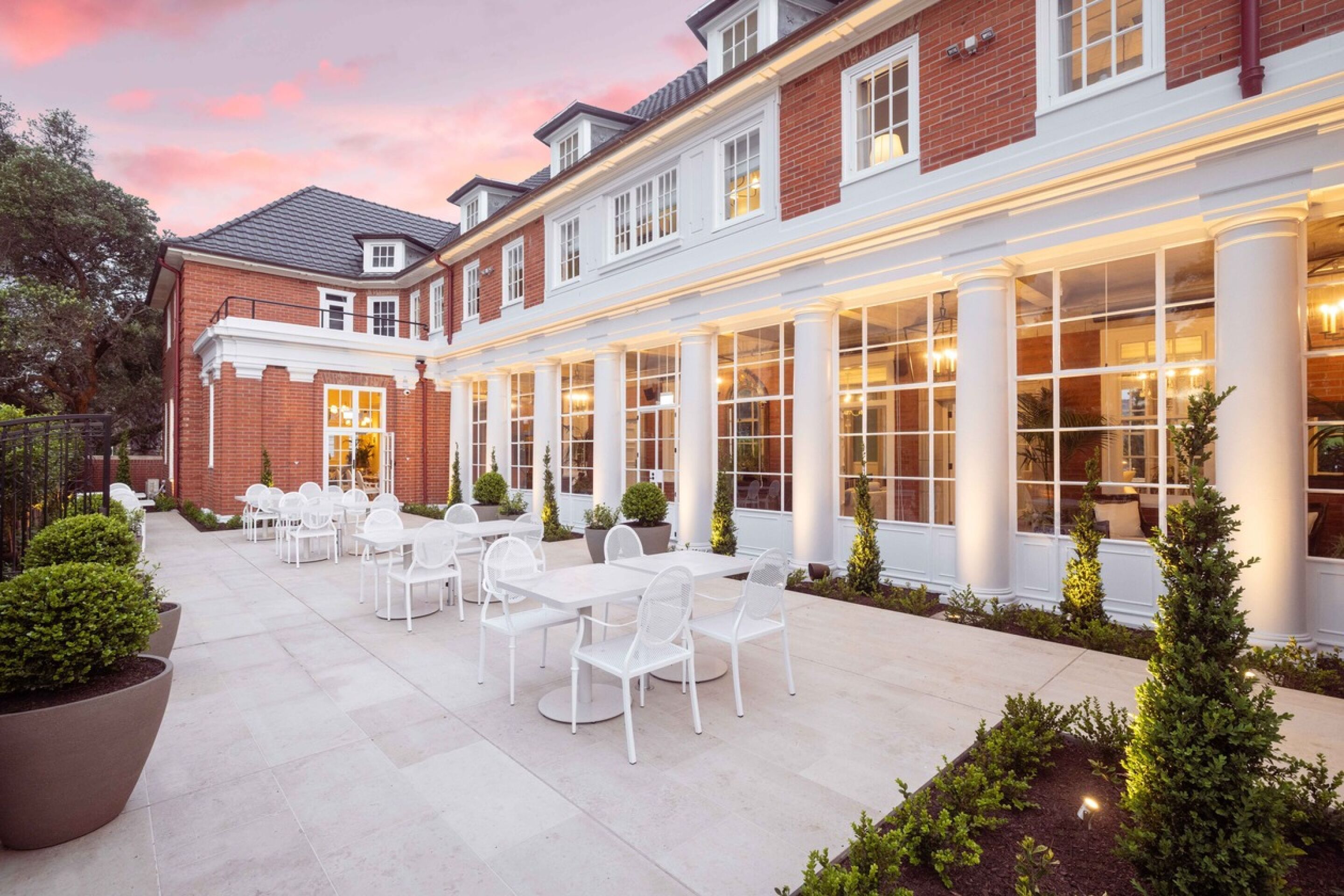
The restoration of Pearson House is now complete. Interior designer Stewart Harris, of Macintosh Harris, having drawn inspiration from its neo-Georgian architecture, has created a richly textured interior design for Pearson House. The architecture of Pearson House stems from a period of renaissance in British design, where the influence of Europe played a major role. The British travelled to Europe and brought back a treasure trove of ideas, which resulted in the creation of a new look that became known as Neo-Georgian. This time heralded the introduction of refined English furniture, bringing a sense of quality that enabled Britain to showcase to the world that they were at the top of their game, and this was reflected in the ingenuity of their interiors.
Stewart has weaved a rich history into the Pearson house design, in a way that is uplifting and modern. The use of colour, attention to lighting with crystals and chandeliers, and furniture inspired by the greats of 18th century furniture makers are blended seamlessly with the modern amenity and functionality required of this exclusive venue.
Inspired by De Gournay
Stewart Harris | Interior Designer
We caught up with Stewart Harris to talk through with him his inspiration for some of the common areas of the Foundation. In particular, his choice of the gorgeous and unique application of De Gournay panels in the lift lobbies and corridors of the Foundation residences.
When I was commissioned in 2020 with the enviable task of designing the first of over thirty individual public spaces throughout the Foundation village, it fell upon me to conceptualise how those spaces would read to the residents. I wanted to ensure there was a sense of permanency, a sense of belonging and a sense of the individual.
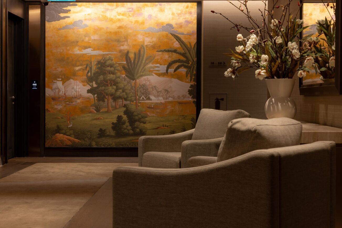
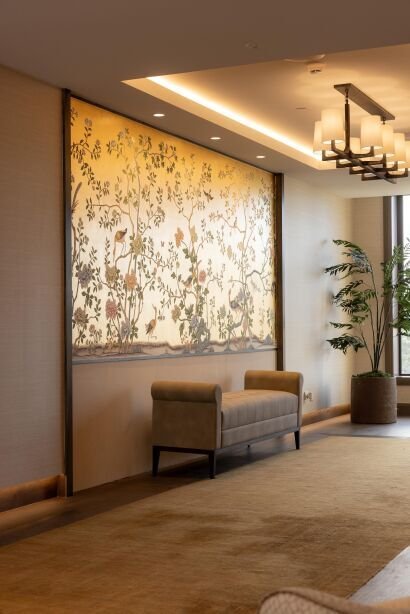
"I imagined how one would journey through the circulation spaces, and how that should be an uplifting experience, with bursts of light and colour along the journey”.
Advised that Pearson House, would form part of the village precinct, this is where I took my cue. I had in mind to marry together the differing styles of architecture throughout the site. Neo Georgian Pearson House to the West and the classically modern apartments to the East.
I thought I could do that with a collection of wallcoverings, artworks, light fittings, and furniture that linked the old and the new together. A collection of the contemporary and the traditional.
So, I used the classical Neo Georgian Pearson House as my starting point. Georgian Interiors celebrated the best in British design through the reign of four Georgian kings.
The architects of the day employed artists and craftspeople to transfer to the homes of the wealthy British, decoration and settings of foreign places so the commissioning of hand painted classical murals in Ballrooms and Drawing rooms became an essential status symbol to any wealthy landowner.
De Gournay was founded by Cecil Gurney in 1986, when he was searching for artists to recreate historical wallpapers for his own home. It led to him working with artists in China to recreate the chinoiserie patterns that had graced historical interiors for over 400 years.
“I had always been captivated by the spectacular colours and intricacy of De Gournay wallpapers”.
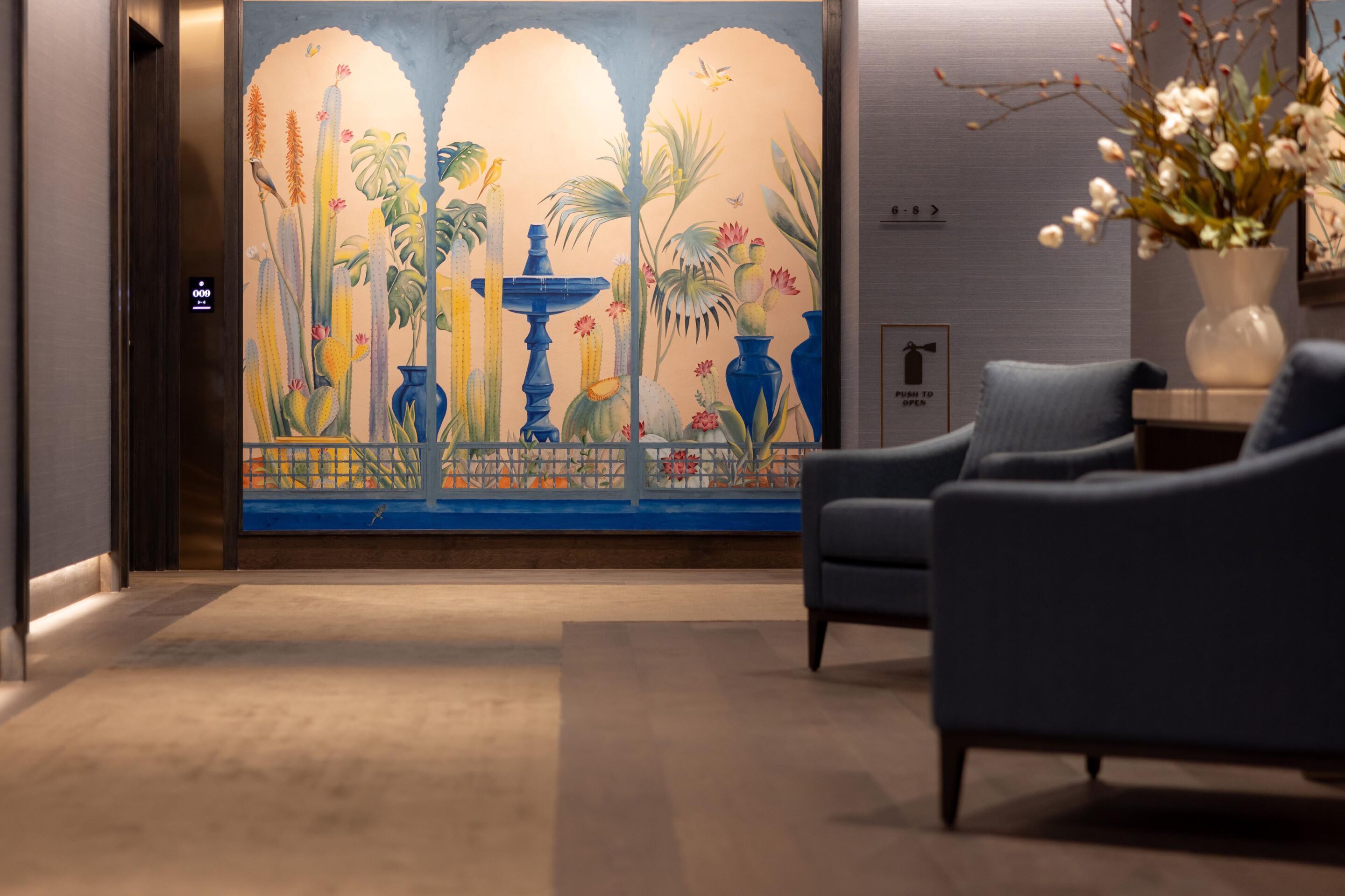
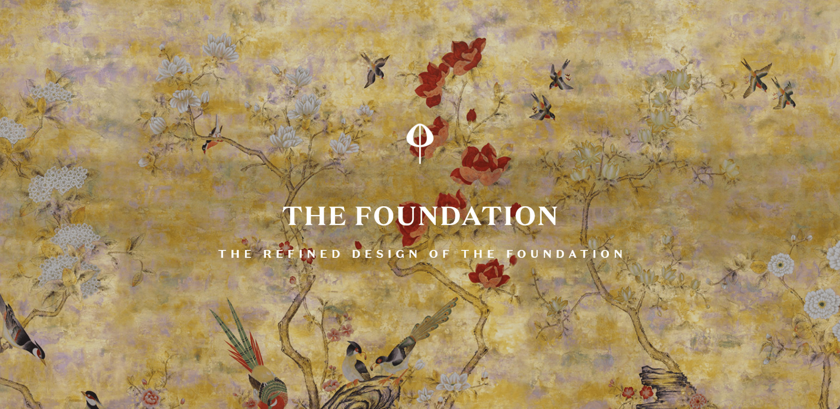
Having worked in Europe for 20 years it was always a huge delight to come across one of their collection in an historic house, so I was delighted to commission 10 pieces with the importers of De Gournay wallpapers [antiques importers Baran de Bordeaux] for The Foundation. I selected a variety of works telling stories of the Pacific, Americas, Asia and Africa. So, there is a journey through each level, in the lift lobbies and transition points around the corridors. Each have been sized to fit specifically into the allocated spaces to ensure the proportions are true to the original drawings, and each have been hand painted by skilled artists.
De Gournay’s most beautiful hand-crafted wall papers embody the signature quality of The Foundation, providing a unique and timeless elegance for residents to enjoy and marvel.

THE JURA LIMESTONE FAÇADE
EXTENSION OF HERITAGE
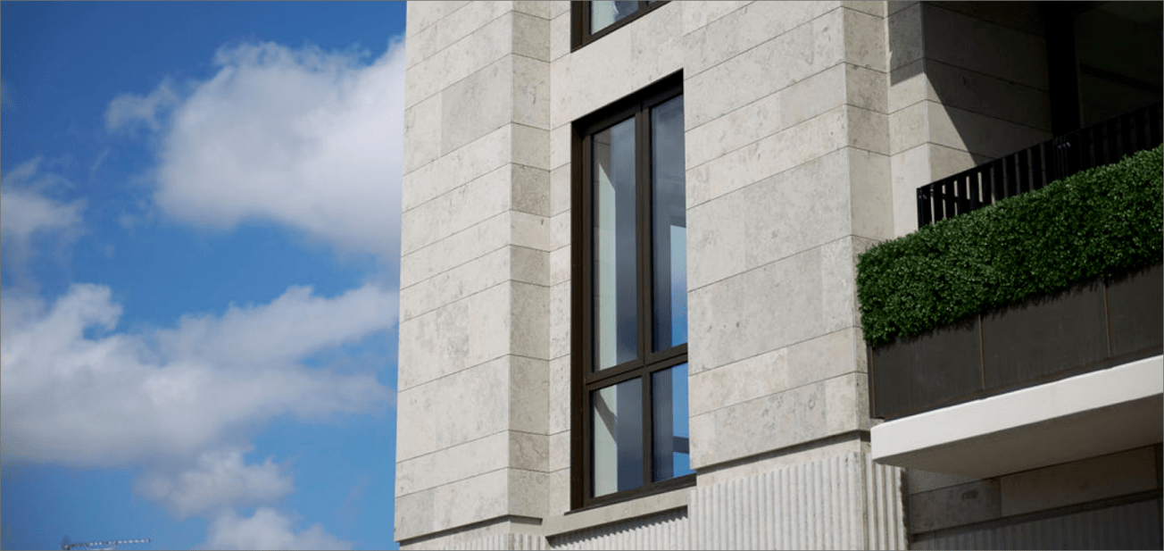
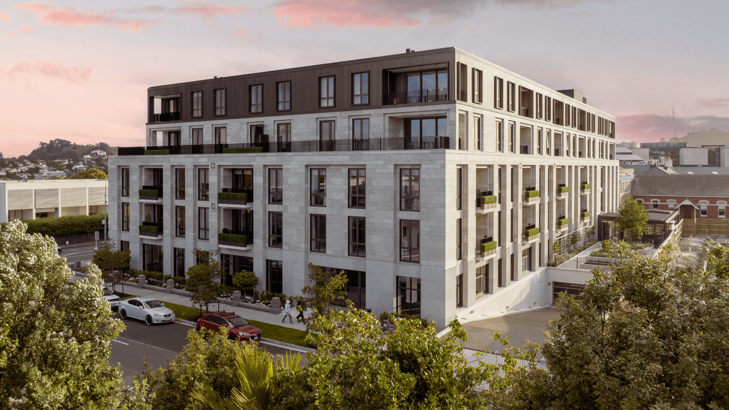
The building façade was a critical aspect of our design, seeking a contrast in materiality to the existing buildings of the precinct whilst reinforcing a sense of permanence with the use of natural stone. Jura limestone sourced from Europe was a natural choice - an extremely versatile stone selected by our architects for its durability, quality, and its aesthetic beauty.
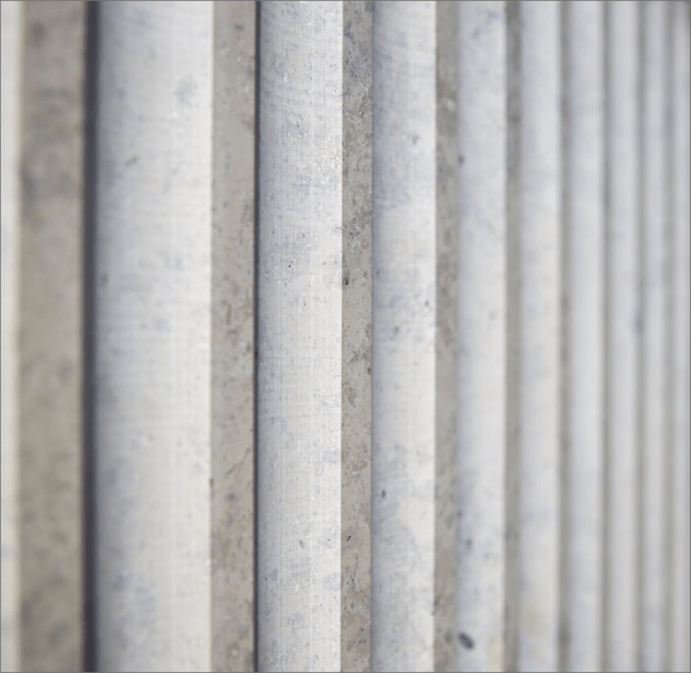
The façade features fluted Jura Limestone on the ground floor which will provide texture and create a podium for the composition of the building. The limestone on the upper floors has been laid in a traditional stretcher bond pattern.
The material for the Foundation has been extracted from a quarry in Kaldorf, Bavaria Germany.
